
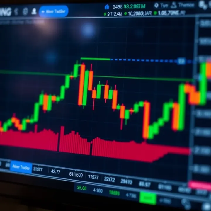
Understanding Trading Graphs for Smarter Decisions
📈 Explore essential trading graphs that reveal price movements, key patterns, and components to help traders in Pakistan make smart market decisions with confidence.
Edited By
James Thornton
Trading charts are the bread and butter of market analysis. Whether you're dabbling in the Karachi Stock Exchange or keeping tabs on international currencies, these charts give a peek into price movements and market sentiment. But for many traders in Pakistan and elsewhere, charts can look like a puzzle wrapped in an enigma—lines and candles moving about without much rhyme or reason.
This guide cuts through the noise to help you understand different trading chart views from the ground up. We'll break down the types of charts you’ll come across, what the essential features mean, and how to actually read them without feeling overwhelmed. You’ll also learn how to customize charts to fit your strategy and spot common errors that trip up even experienced traders.
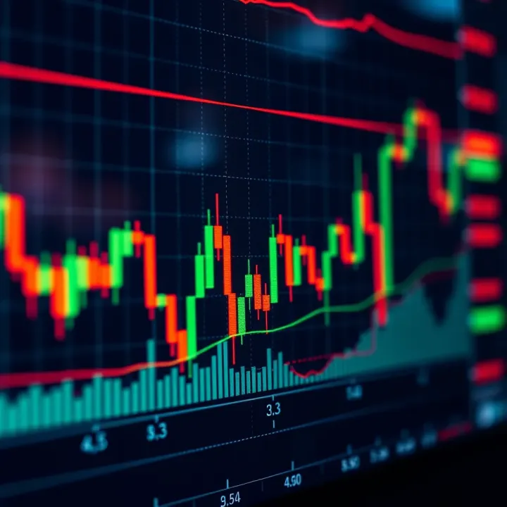
Why does this matter? Because a solid grip on chart analysis can turn a hit-or-miss trade into a calculated move. It helps you get your timing right, identify trends early, and avoid following the crowd blindly. By the end of this guide, you’ll have practical tools that improve your ability to make informed trading decisions—whether you’re trading local shares, forex, or commodities.
Remember, charts are not magic; they’re tools. How well you use them can make all the difference in your trading results.
Trading chart views are the backbone for anyone serious about the market, whether you’re a seasoned pro or just taking your first steps into the world of trading. At its core, a trading chart view is like a window into the market’s behavior over time, showing you how prices move and help in spotting trends or patterns. Without understanding these views, making informed decisions or timing your trades could feel like shooting in the dark.
Imagine a Karachi trader watching the Pakistan Stock Exchange trying to decide when to buy shares of a local textile company. Without a clear picture on a chart, decisions might rest purely on hearsay or gut feeling, which can be risky. Conversely, a good chart view offers concrete data visualized in a way that’s easier to digest, making complicated price movements simpler to analyze.
What makes this introduction crucial is setting the stage for the rest of the article—grasping not only what trading chart views are but also why they are a must-have tool for virtually any trading strategy. From spotting quick scalps on the MetaTrader platform to long-term position trading on TradingView, knowing how to use charts effectively can really up your game.
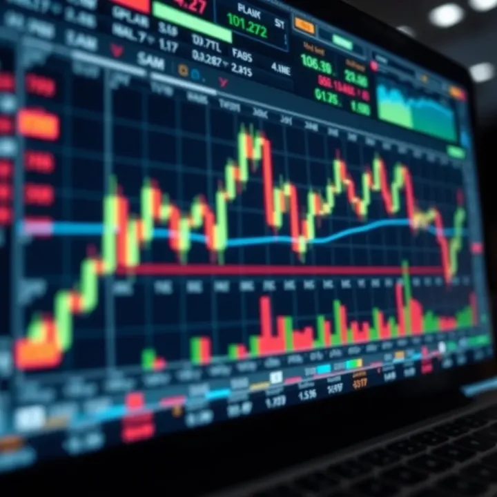
A trading chart view is a graphical representation that shows the price movements of financial assets over time. These charts plot prices against time intervals—like minutes, hours, or days—to help traders track changes and predict future movements. Unlike a simple list of prices, a chart view offers a visual story of how the market has behaved, making it easier to find clues about what’s next.
For example, if you check a candlestick chart for the Oil market futures on any popular platform like MetaTrader, each candle provides information about the opening price, closing price, high, and low for a specific period. This detail-packed view helps traders make fast, informed decisions instead of guessing based on numbers alone. The key takeaway? Trading chart views transform raw price data into an understandable visual format, saving time and reducing guesswork.
Trading without chart views is like trying to navigate the streets of Lahore without a map or GPS—possible but unnecessarily difficult and prone to error. Chart views matter because they give traders context. They reveal trends, reversals, and potential breakout points that written prices or news alone can’t provide.
Take volume indicators, for example. When combined with price charts, these indicators confirm the strength of a price move. A surge in volume with a breakout candlestick might suggest a strong buy signal, helping traders avoid traps set by false price moves. Without this, traders might enter or exit at the wrong time, resulting in losses.
Moreover, chart views enable tailoring to fit various trading styles—whether it’s day trading, swing trading, or investing for the long haul. By analyzing different chart types and timeframes, Pakistani traders can align their strategies with local market nuances and their personal risk appetite, making the charts not just a tool but a trading companion.
Remember: Effective chart reading can be the difference between hitting a profit target and getting stuck in a losing trade. That’s why mastering chart views isn’t optional if trading matters to you.
Understanding these basics in this section will prepare readers to confidently explore different chart styles, components, and interpretation methods explained later in the article.
When you're trying to make sense of the market's ups and downs, the kind of chart you use can make a big difference. Trading charts offer visual snapshots of price movements and trend directions, helping traders to figure out when to buy or sell. Understanding the common types of trading charts is essential because each one tells a story in its own way, suited to different trading styles and analysis needs. From quick scalping to long-term investing, knowing the strengths and limits of these charts will put you ahead.
Line charts are the simplest kind you'll find — they trace the closing prices over a set period connected by straight lines. Imagine tracking the daily closing price of Pakistan Stock Exchange’s KSE 100 index: each day's closing value gets a point, and those points get linked up. This gives a smooth, easy-to-read line that highlights the general direction of price changes without the distractions of intraday ups and downs. It's like drawing the outline of a mountain range rather than every pebble on the path.
This simplicity can really help when you're trying to get a quick sense of where the market's heading over weeks or months without getting bogged down by volatile price swings during the day.
Line charts shine when you want the gist of price movement without the extra noise. They're great for spotting broad trends or comparing one stock's movement to another over time. For example, if you’re keeping an eye on how Oil and Gas Development Company Limited (OGDCL) performed over the past year, a line chart cuts through the clutter.
This chart type is especially useful for beginners or anyone wanting to avoid the details of intraday price changes. It’s not ideal if you need exact highs, lows, or open prices, though. In short, use line charts when your focus is on closing price trends and not the detailed price action within a single day.
Bar charts pack more detail than line charts by showing open, high, low, and close prices (OHLC) for each time period. Each bar looks like a vertical line with horizontal ticks extending left and right. The vertical line runs from the lowest to the highest price during that time frame. The small left tick shows the opening price, and the small right tick shows the closing price.
For example, if you watch the bar chart for Habib Bank Limited (HBL) over a single trading day, each bar could represent one hour's crisp snapshot of price movements. This breaks down not just where the price ended, but what happened in between.
Bar charts offer a fuller picture of price activity without being too complicated. By showing the range and direction of price moves clearly, they help traders spot volatility, momentum, and potential reversal points. This detailed view is key if you want to watch intraday swings in Pakistan's volatile markets.
Traders who like to use technical analysis tools—like MACD or Bollinger Bands—often prefer bar charts because they provide the granular data these tools need to identify entry and exit points. This makes bar charts a versatile choice, balancing detail with readability.
Candlestick charts are like bar charts but packed with extra visual cues. Each “candlestick” shows the open, high, low, and close for a time period, but the body of the candle is colored or shaded to indicate whether the price closed higher or lower than it opened. A green (or white) candlestick means the price rose (bullish), while a red (or black) one means it fell (bearish).
For instance, watching the candlestick chart for Lucky Cement on a daily basis, you would immediately see if today's trading resulted in gains or losses, making spotting momentum shifts easier.
Candlesticks come with patterns that hint at what might happen next. A "hammer" candle, small body with a long lower wick, can signal that the market found a bottom and might bounce back. A "shooting star" — the mirror image with a long upper wick — sometimes means the uptrend is running out of steam.
Traders in Pakistan who pay attention to these signals can sometimes spot reversals before they show up on other charts. For example, if the National Bank of Pakistan’s stock forms a bullish engulfing pattern, it might suggest a good time to enter a long position.
Remember: No chart type or pattern promises success. Each is a tool helping you make informed guesses, not crystal balls.
Summing up: Picking the right chart depends on your trading plan. Line charts give clean simplicity, bar charts provide detail with clarity, and candlesticks offer visual depth and signals. Master these, and you'll read the market’s story better than most.
Trading charts might look like a jumble of lines, numbers, and colors at first, but each element serves a clear purpose. Understanding the basic components of a trading chart is like getting the blueprint for a house—it helps you make sense of the structure and figure out how you can use it to your advantage. This section breaks down the key pieces you'll encounter on virtually any chart, making it easier to interpret market moves and act promptly.
Every trading chart has two fundamental axes that frame what you see: the price axis (usually vertical) and the time axis (usually horizontal). The price axis displays the value of the asset, such as a stock, currency, or commodity. It helps traders see at a glance how high or low prices have moved over a given period. The time axis charts the progression of time, often ranging from minutes to months, depending on the trader’s focus.
For example, in a daily chart for Pakistan’s KSE index, the time axis will show days, while the price axis displays the index’s point value. If you try to analyze tomorrow’s price without grasping this setup, you might misunderstand the scale or direction of movement. Noticing how the scales adjust—sometimes a price axis is linear, other times logarithmic—is also important, especially for assets that have had significant price swings.
Volume indicators reflect the number of shares, contracts, or lots traded during a specific period and are usually shown as bars below the price chart. They’re invaluable because they reveal the strength or weakness behind price moves. Picture a sudden jump in stock price but with very low volume; this could signal a weak rally prone to reversal.
In Pakistan’s trading scene, say you’re watching GlaxoSmithKline Pakistan Ltd. If its price rises steadily with growing volume, it’s a sign that buyers are genuinely interested, making the move more trustworthy. On the other hand, if volume shrinks during an uptrend, it may warn that momentum is fading.
Volume indicators also help spot potential breakouts or breakdowns at key support or resistance. When volume surges at these points, it usually confirms that a significant price shift is underway.
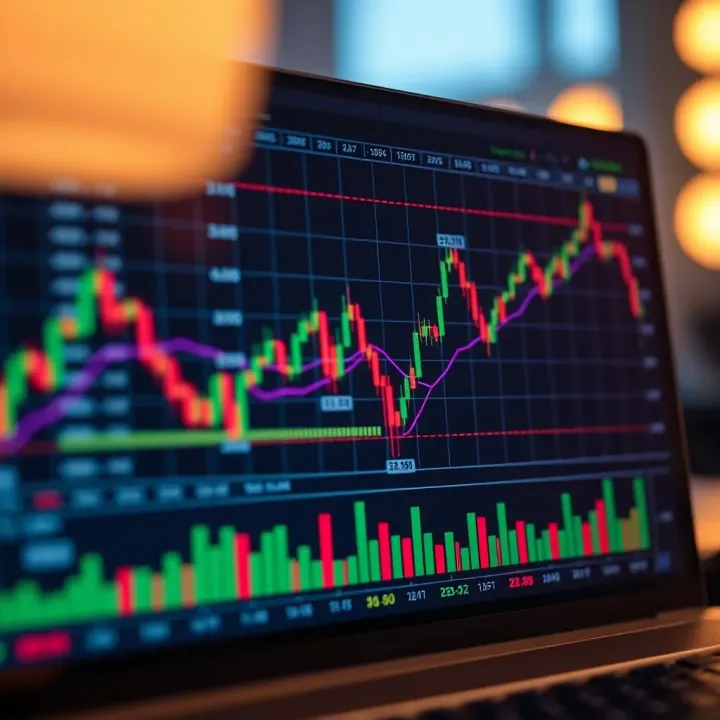
Technical indicators are formulas plotted on charts to provide insights beyond what price and volume can show alone. They can highlight trends, momentum, volatility, or market strength. Let’s look at a few of the most useful ones.
Moving averages smooth out price data to help traders spot trends by filtering out day-to-day noise. The most common ones are the simple moving average (SMA) and the exponential moving average (EMA). For instance, a 50-day SMA shows the average closing price over the last 50 days.
These averages act like a guide rail on the chart. When a stock price crosses above its moving average, it might be a signal the asset is gaining strength. Conversely, a drop below suggests weakness. Pakistani traders often watch the 20-day and 50-day moving averages to time entries and exits.
The RSI is a momentum oscillator that gauges the speed and change of price movements. It moves between 0 and 100, with readings above 70 suggesting an asset could be overbought, and below 30 indicating it might be oversold.
Imagine a forex pair like USD/PKR; if RSI spikes past 70, it warns the price could soon reverse or pause. The RSI can help traders avoid chasing prices when markets get overheated.
Bollinger Bands are volatility bands placed above and below a moving average. They expand and contract based on market volatility. When bands are narrow, it signals low volatility and often precedes a big price move. Wide bands indicate high volatility.
For example, a Pakistani equity like Meezan Bank often shows Bollinger Bands tightening right before a notable price jump or drop. Traders use these bands to estimate whether prices are high or low on a relative basis and to spot potential breakout moments.
Understanding these components and indicators will help you see beyond the raw price data and make informed trading decisions based on clearer market signals.
Breaking down these elements allows traders to tailor their chart views to match their strategies. Whether you prefer quick scalping or a longer-term hold, knowing these basics ensures you’re not flying blind when watching the markets.
Reading and interpreting trading charts is fundamental for any trader looking to make informed decisions. Charts offer a visual way to understand market behavior, revealing trends, price movements, and potential turning points. For traders in Pakistan and elsewhere, mastering chart reading can turn guesswork into strategy, enabling clearer entry and exit points.
Getting a grip on chart interpretation means you'll be watching what the market is really up to, instead of just guessing based on news or gut feelings. For example, seeing a steady upward trend on a candlestick chart might nudge a trader to consider buying before prices get too high. Likewise, recognizing when a price is hitting a ceiling repeatedly can signal a good time to sell or hold off on buying.
An uptrend is basically when prices are moving steadily higher, and conversely, a downtrend is when prices are dropping over time. Identifying these trends early can be your trading GPS. In an uptrend, each successive high and low is typically higher than the last — think of it as climbing a staircase where every step leads upward. Downtrends show the opposite pattern.
Spotting these trends helps traders decide the right move. For example, during an uptrend, a trader might look for dips to buy, while in a downtrend, it might be safer to wait or short sell.
Chart patterns give clues about where prices might go next. The 'Head and Shoulders' is a classic pattern signaling a potential reversal. Picture a baseline with three peaks: the middle one (head) is the highest, flanked by two smaller peaks (shoulders). When this pattern forms after an uptrend, it often suggests the market is about to turn downward.
Traders watch for the "neckline," a support level connecting the lows between the peaks. A break below this neckline can be the signal to exit a long position or even enter a short one, anticipating prices to fall further.
Support and resistance levels are like invisible barriers where price tends to stop and reverse. Support acts as a floor, where buyers step in and prevent prices from falling further. Resistance is a ceiling, where selling pressure pushes prices down.
For example, if a stock repeatedly bounces off a price around 200 PKR, that level is your support. Knowing these levels helps traders set stop-loss orders or predict when the price might reverse, reducing risk.
Volume shows how many shares or contracts have traded during a time period. It’s a key factor to confirm if a price move is genuine. Imagine price breaking out above resistance on low volume – it might be just a flash in the pan. But when volume surges alongside price movement, it indicates real interest and more reliability.
For instance, a breakout of a resistance level in Karachi Stock Exchange accompanied by sharp volume increase could signal a strong bullish trend, encouraging traders to enter a position.
Tip: Always pair volume analysis with price action to avoid false signals and make better trading calls.
In short, reading charts well means understanding these elements together. Trends, patterns, support/resistance, and volume act like puzzle pieces that fit to reveal the bigger market picture. With practice, traders can spot setups and time trades with more confidence and less second-guessing.
Customizing your trading chart view is like adjusting your car’s mirrors before hitting the road—it sets the stage for a clearer view of what’s ahead. In trading, no two strategies are the same, so personalizing the charts helps traders focus on the information that matters most to them. Whether you’re a day-trader in Karachi scanning 5-minute charts or a long-term investor in Lahore relying on weekly graphs, tweaking your chart view can improve clarity, reduce noise, and highlight critical patterns.
For example, by selecting specific indicators and time frames, traders can match their charts to their strategy’s rhythm. Customization isn’t just about aesthetics, either; it’s a practical move to help avoid confusion that can come with cluttered or default setups. The key takeaway: the right chart view can make spotting trends and signals feel less like guesswork and more like planning.
Understanding the right time frame for your trading strategy is essential: it’s about syncing your actions with the market’s pulse. Short-term charts, like 1-minute or 15-minute intervals, cater to active traders looking to exploit quick price fluctuations. For instance, a scalper on MetaTrader might use 1-minute charts to catch tiny price moves multiple times a day. These time frames provide lots of detail but can also be noisy and require quick decision-making.
On the flip side, long-term charts—daily, weekly, or monthly—offer a broader perspective suited for investors focusing on major trend directions. A Pakistani stocks investor, trading through platforms like IG or local brokers, might rely on weekly charts to discern solid support and resistance levels, ignoring fleeting market jitters. This slower pace gives more confidence in the durability of signals but demands patience.
Balancing these time frames is vital. Using multiple views, like pairing a daily chart with an hourly one, can provide both the big picture and real-time entry points. Choosing a time frame that aligns with your trading style avoids confusion and helps in filtering out irrelevant market noise.
Indicators are like spices in a recipe: the right amount enhances the flavor, but too much spoils the dish. Customizing your chart means carefully selecting which indicators to display based on your strategy and the asset’s behavior. For example, if you’re trying to spot momentum shifts, a Relative Strength Index (RSI) might be perfect. But stacking fourteen indicators won’t help; it just clutters your chart and muddies the decision-making process.
Most trading platforms, such as TradingView and MetaTrader, make it easy to add or remove indicators with just a click. Don’t hesitate to experiment with combinations—the key is finding what clicks for you. For instance, many traders combine Moving Averages with Bollinger Bands to confirm trends and volatility. But if an indicator isn’t providing useful signals or is causing analysis paralysis, it’s better to remove it.
Remember, less is often more—the goal is clarity, not complication.
Alerts and annotations act as your personal assistants on trading platforms, helping you catch important market moves without staring at charts all day. Alerts can notify you when prices hit specific levels, indicators trigger signals, or trend lines break. Setting these up on platforms like MetaTrader or TradingView saves time and keeps you connected to critical events, especially if you’re juggling other responsibilities.
Annotations, like drawing trend lines or adding text notes, make your chart a journal of insights and reminders. For example, marking a support level or flagging a pattern like a double bottom helps when reviewing charts later—especially for beginners who benefit from visual cues.
A practical tip: use distinct colors and clear labels in your annotations to keep things organized. Regularly reviewing these notes refines your understanding of market behaviors and improves your overall analysis skills.
In short, customizing your chart view by choosing appropriate time frames, adding relevant indicators, and setting alerts with annotations can transform raw data into a well-organized, actionable tool tailored to your trading style and goals.
Trading charts are powerful tools, but getting the most out of them isn’t always straightforward. Traders often encounter several challenges that can cloud judgment or lead to mistakes if not handled carefully. Understanding these common hurdles helps you avoid costly errors and improves your trading decisions, especially in fast-paced markets like Pakistan’s stock exchanges.
One major pitfall is information overload. Trading platforms, like MetaTrader or TradingView, cram charts with tons of indicators, lines, and data points. At first glance, it might seem helpful, but too much info can slow you down or distract you from the actual price action. For example, it's common for a trader to layer multiple moving averages, RSI, MACD, and Bollinger Bands in one chart—only to struggle deciding which signal to trust.
A practical approach is to keep it simple: focus on 2-3 indicators you understand well and that fit your trading style. If you’re swing trading, relying heavily on short-term indicators can lead you astray. Instead, pick tools that highlight broader trends. This keeps your charts clean and decisions clearer, avoiding paralysis by analysis.
False signals are like worms in your bait—tempting but not really useful. They’re perhaps the most frustrating challenge because they can trigger premature buys or sells. For instance, a candlestick might show a bullish engulfing pattern, but the price might still tumble afterward due to weak volume or external news.
To handle false signals, always look for confirmation from volume or secondary indicators. If RSI shows oversold territory but there’s no uptick in trade volume, that bullish sign might be a dud. Also, integrating support and resistance levels can filter out noise. A breakout above a strong resistance line backed by volume tends to be more reliable than just a random candle pattern.
Charts don’t act alone—traders bring their own psychology to the table. Biases such as confirmation bias or overconfidence can make you see what you want rather than what's really there. For example, if you’ve bet on a stock, you might ignore bearish signs because you don’t want to face a loss.
Being aware of these biases helps. Keep a trading journal to track your decisions and feelings. Regularly review trades and question why you acted a certain way. It also helps to step away periodically from your screens, especially after a big loss or win, to reset your mindset. Remember: the market is indifferent to your hopes or fears.
The best traders recognize their mistakes quickly and adapt, using chart views as tools—not crystal balls.
By recognizing these challenges—information overload, false signals, and psychological biases—you build resilience against common trading pitfalls. This not only sharpens your chart reading skills but also builds confidence in your decisions over time.
In today’s trading world, having access to the right platform can make a big difference. Different platforms offer unique chart views and tools that help you analyze prices better. Whether you're trading forex, stocks, or commodities, features like customizable charts, various time frames, and advanced indicators can shape your decision-making process. Let's look at some popular platforms traders often rely on and what makes their charting capabilities stand out.
MetaTrader, especially MetaTrader 4 and MetaTrader 5, is a staple for forex and CFD traders worldwide, including many in Pakistan. It’s known for its straightforward interface and powerful charting tools. MetaTrader offers:
Multiple Chart Types: Choose from candlestick, bar, and line charts, each serving different trading styles.
Wide Range of Time Frames: From one minute up to monthly, catering to scalpers and long-term traders alike.
Custom Indicators and Expert Advisors (EAs): You can download or create indicators using its proprietary MQL language, letting you spot signals or automate trades.
Real-Time Data and Alerts: Keep tabs on key price movements with custom alerts.
For example, Pakistani traders who follow currency pairs like USD/PKR can set up MetaTrader with custom templates showing moving averages and RSI to catch entry points faster. Plus, the platform is light on system resources, so it runs smoothly even on modest setups.
TradingView has become increasingly popular thanks to its web-based platform that’s accessible anywhere without any installations. It offers some of the most advanced and interactive charting features:
User-Friendly Interface: Drag and drop tools make drawing trend lines, Fibonacci retracements, or annotations quick and easy.
Social Community: Traders share their charts and ideas, which can help beginners learn new setups.
Extensive Indicator Library: Over 100 built-in indicators plus the ability to use custom scripts via Pine Script.
Multi-Device Synchronization: Start analyzing on your desktop, continue on your phone, and keep all settings synced.
If you trade Pakistani stock market indices or commodities, TradingView’s real-time data and news integration allow you to react quickly. For instance, spotting support on the KSE-100 becomes handy, and you can combine volume and MACD indicators for better confirmation.
Local brokers often provide their own trading platforms or apps tailored for Pakistani traders. These platforms usually focus on local stocks and currency pairs, integrating Pakistan-specific market data, regulatory requirements, and payment methods.
Custom Market Watchlists: Easily track popular local securities like companies listed on the Pakistan Stock Exchange.
Simplified Chart Tools: Many local platforms offer essential chart types plus fundamental data designed for traders getting started.
Mobile-Focused Apps: Given Pakistan’s high mobile usage, brokers frequently emphasize apps with push notifications and simple order placement.
For example, brokers like JS Global and Arif Habib Limited provide platforms where traders get quick access to PKR pairings and can use basic candlestick charts combined with volume. These are less complex than international platforms but help users remain focused without getting overwhelmed.
Choosing the right platform depends on your trading goals and the instruments you focus on. While international platforms like MetaTrader and TradingView offer depth and flexibility, local broker platforms provide tailored experiences for Pakistani markets.
By understanding the chart features each platform offers, you can better align your tools with your trading strategy, making analysis clearer and more actionable.
For anyone stepping into trading, the dizzying array of chart types, indicators, and tools can feel overwhelming. Beginning with clear, practical tips on using trading chart views helps lay a solid foundation, reducing mistakes and enhancing confidence early on. It's about starting smart—not complicated—and gradually building your skillset in a way that matches your trading style and goals.
Jumping straight into complicated charts plastered with dozens of indicators is like trying to run before you can walk. Beginners should begin with the basics—like candlestick charts paired with just a couple of main indicators such as moving averages or the Relative Strength Index (RSI). For example, a 50-day moving average can help reveal general trend directions without clutter, while RSI shows overbought or oversold conditions clearly. This simplicity helps you recognize patterns and price movements without getting bogged down by noise.
Starting with less enables you to develop intuition and avoid paralysis from information overload. Many new traders get confused by conflicting indicator signals, which often leads to hesitation or poor decisions. Keeping charts minimal lets you focus on key signals and build understanding naturally. As you grow more comfortable, you can experiment with adding more indicators or switching between chart types like bar charts or line charts.
Real-money trading can be nerve-wracking, but thankfully, demo accounts let you practice chart analysis and trading strategies risk-free. Using platforms like MetaTrader or TradingView, which are popular in Pakistan, you can test how well you understand chart signals without the stress of losing money.
By simulating trades based on chart views, you learn how to spot entry and exit points, confirm trends, and manage risk more effectively. This hands-on experience is invaluable, as theory only takes you so far. For instance, if you notice a head-and-shoulders pattern developing on a candlestick chart, you can see firsthand if that pattern plays out as expected before risking actual funds.
Repeated demo trading sessions build muscle memory, improving your speed and accuracy when reading charts. It also helps fight common rookie mistakes like reacting too quickly to temporary price spikes or ignoring volume confirmations. Over time, this practice boosts your confidence and increases the chances of consistent success when transitioning to live trading.
Remember, trading charts are tools to help you make better decisions—start simple, practice often, and avoid rushing headlong into complexity. This approach keeps your trading journey steady and more rewarding.
Blending chart analysis into your trading plan isn't just about slapping on some indicators and hoping for the best. It's a strategic move that helps ground your trades in data and patterns you've seen unfold over time. When you integrate charts thoughtfully, your decisions shift from guesses or gut feelings to informed, calculated plays.
Consider a trader in Karachi dealing with oscillating Forex rates. If they rely solely on fundamental news—like interest rate changes or political events—they might miss subtle patterns in price movement captured by charts. Chart analysis fills that gap, offering visual cues such as trendlines or moving averages to guide entry and exit points. This dual approach can reduce risks and improve profit chances.
Successful traders often say that charts tell stories. Integrating these stories into your overall plan lets you anticipate market moves rather than just react to them.
Charts and fundamentals often get treated like separate beasts, but really, they’re two sides of the same coin. Fundamental analysis digs into why a market moves—think earnings reports, economic data, or geopolitical shifts—while chart views reveal how those moves play out on price and volume.
For example, a Pakistani stock might suddenly gain after a positive government policy announcement. A trader combining this info with candlestick patterns noticing a bullish engulfing signal could have more confidence to act.
This combo helps traders avoid being blindsided by noisy price action alone. If fundamentals are weak but charts indicate strength, or vice versa, it signals caution.
Charts give clear hints about where price might head, but setting goals without understanding those signals can lead to disappointment. It's key to define targets that match the chart's story and your risk tolerance.
If your chart shows a strong resistance level just up ahead, aiming for triple-digit percentage gains overnight might be wishful thinking. Instead, set modest profit goals near that resistance and use stop-loss orders to limit losses.
For example, a trader spotting an uptrend on a 4-hour chart for the PKR/USD might set a target at the previous swing high. This approach hedges against sudden reversals common in volatile markets.
Realistic goals also mean acknowledging your own limitations and market conditions. Patience pays off in the long run more than chasing after unrealistic wins.
By weaving chart analysis with other tools and realistic goals, your trading plan becomes more than just a list. It turns into a compass navigating the often choppy markets with clearer direction and confidence.
📈 Explore essential trading graphs that reveal price movements, key patterns, and components to help traders in Pakistan make smart market decisions with confidence.
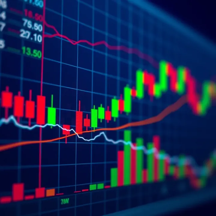
📊 Dive into trading charts to master price moves & market trends! Learn types, patterns & strategies for smarter trading decisions in Pakistan markets.

Explore trading platforms: types, key features, security, and tips for beginners. Learn to choose wisely and trade smartly in Pakistan's market 📈🔒
📊 Learn how trading signals work in forex & stocks! Explore types, risks, & tools with practical tips tailored for traders in Pakistan and beyond.
Based on 10 reviews